
It is no secret that I am a bit of a font geek. It is also no secret that I (like many others) dislike the widespread use of Comic Sans. Sites such as Comic Sans Criminal are solely devoted to the derision of the font.
The main reasons why Comic Sans bears the brunt of this font snobbery, really comes down to fonts having a personality and purpose: in the case of Comic Sans, it has a childish, overly informal quality, that I feel suits a very limited range of writing.
 Fonts are the clothes with which we dress our words.
We need to choose a font to match the way we want our text to be received. If we want to be taken seriously, Comic Sans would not be a natural choice.
Many educators choose Comic Sans deliberately because it is one of the few fonts available natively on both Mac and PC which has a ‘true a’ – that is, an ‘a’ which is a circle and stick (rather than the one used in my current font!). “I know Comic Sans isn’t the greatest,” they say, “but it has the ‘true a’.”
It’s time for me to be solution-focused! Here are some alternative fonts you can use that contain a ‘true a’.The following fonts you will need to download and install on your computer:
 Hattori Hanzo Light Italic (make sure you select light italic, as the regular version does not have a ‘true a’.)

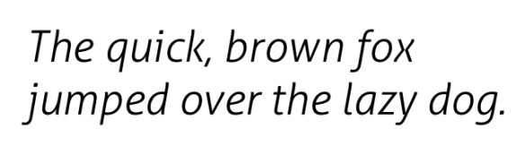
Aller Light Italic (make sure you select light italic, as the regular version does not have a ‘true a’.)
The following fonts are also Google Fonts, so you can use them in your docs/sites too.
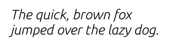
Muli (the whole font family works well with a ‘true a’.)

Ubuntu Regular Italic (install the whole font family, or select regular italic to get the ‘true a’.)
Architect’s Daughter (this installed better for me within Google Apps)
I hope this helps you! What other fonts do you know of that have a ‘true a’?
Image Credit:
CC licensed (BY-ND) flickr photo by (debz): http://flickr.com/photos/debbybosman-debz/4109261288

Love Hatori Hanzo Italic, that’s my fave.
In Google Docs so many options, but my top choices are: Handlee & Shadows Into Light Two.
LikeLike
Comic sans is in size 14 or larger has been shown to make reading easier for dyslexic learners. That is why I like it and use it a lot.
LikeLike
Hi Danella,
I certainly approve and appreciate teachers taking into consideration dyslexic learners, however I am not sure their faith in Comic Sans is justified. This blog post https://creativemarket.com/blog/2014/05/14/is-comic-sans-easier-for-dyslexic-users-to-read is one of many indicating that font style (sans serif, Roman, monospaced) might have more of an impact on dyslexic learners.
LikeLike
If you want a font that may work for dyslexic learners, try Open Dyslexic. The letters are heavy at the bottom, which is supposed to make them easier to read/less likely for the reader to see them as flipped or reversed.
On the website, http://opendyslexic.org/, they say, “There are two versions of OpenDyslexic in the (free) download. OpenDyslexic-Alta includes the handwritten/rounded/comic sans like/circle ‘a’ that you may like.”
LikeLike
These are great, however I’m also a stickler for a true ‘q’. Do you know of any other good ones with both?
LikeLiked by 1 person
OOoh, that is a great point! I will try to hunt some down! Thanks for the feedback 🙂
LikeLike
Great post! I have a deep dislike of Comic Sans, and really like the alternatives you have listed here. I really like the way you described fonts as having a personality, and love the comicsanscriminal.com website. Thanks.
LikeLike
I always felt it was a bit ridiculous too, however couldn’t really pin-point what it was about it until the notion of fonts having both a personality and a purpose was made clear to me. If you liked Comic Sans Criminal, you might also like College Humor’s Font Conference https://www.youtube.com/watch?v=i3k5oY9AHHM&hl=en-GB&gl=SG Sadly, not appropriate to share with the students I teach, but funny all the same.
LikeLike
I loves me some font talk.
My favourite Google fonts with true A are Comfortaa and Didact Gothic. Architects Daughter is the only handwritten I ever use.
LikeLike
Thanks for sharing this list. I am always on the hunt for new, stylish, and primary friendly fonts too- especially those available in google drive. Happy Monkey, Raleway & Corsiva are my current favourites but I haven’t found the perfect q, a and t yet….
LikeLiked by 1 person
Have you tried Sassoon Infant and Sassoon Primary?
LikeLike
Pingback: The power of an image | A neverending learning journey
I spent 30 years of my life unable to read, I cheated in school since 6th grade when I lied about the books I read otherwise the class wasn’t going to get to go on a pizza party for Book It. I also went to college for animation and learned design and became a font snob myself.
So recently when I ironically changed my font systemwide to comic sans when I switched from mac to windows and wanted to make windows as frugly as it feels – and it turned out I responded well to it and I realized I was dislexic, my life since then this has been the first time I have been able to read ever.
I cried the first time all I did was I just read through an article that interested me a couple months ago. I didn’t have to stop. It feels like discovering you needed glasses for your brain. I can get by pretending I dont have this problem but the reality is I need it as a daily driver. I tried other fonts and really comic sans ms on a mac is the best to me, It’s just the least distracting. Imagine your entire life trying to read a book, reading one sentence then forgetting it, reading a page over and over and giving up reading. Imagine how hard all card games are, video games are, try living in another country and learning another language with this problem.
You all can be snobs about this and talk shit all you want but I’m reading this website in comic sans and able to write a comment in comic sans. I’m just leaving this here for anyone else who has my problem, you could be dislexic and not know it, you could be color blind and not know it, the accessibility settings on a computer or phone can help, and just changing the default font to comic sans in your browser and checking the box to tell it to override the websites is what works for me.
My two bits, that being said I do enjoy joking about fonts and I’m going to check those websites out even tho to me it’s pretty obvious the popularity of comic sans is just people who have difficulty reading and are instintively responding to it, but we’ve all got our own quirks and different things work for each of us.
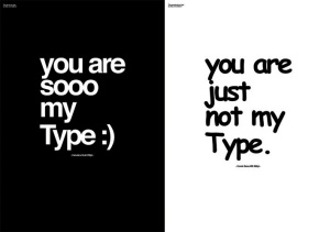
For me though like with your poster example, I was able to read the one on the right almost instantly, the one on the left took at least a couple seconds to absorb, I had to read through it a couple times, .. so for me what is a better advertisment one I will read or one that I won’t because it’s difficult to.
anyway, my beef now is with Papyrus there’s something we can all gang up on lol
LikeLiked by 1 person
I’m glad you’ve found a font that works for you, and if it brings you joy and ease in reading, then that’s fantastic. Of course, all users have preferences, and I hope someone considers doing some evidence-based research on this.
I can definitely get behind a beef with Papyrus. Have you seen the designer who combined Papyrus & Comic sans? Very funny (but still awful) https://creativemarket.com/blog/designer-combines-papyrus-and-comic-sans-the-end-is-near
LikeLike
just want to share two things:
1) thankyouthankyouthankyou for all the “real a” font recommendations ❤
2) people who don't need glasses only judge them as fashion accessories. people who need glasses also judge them for their function. now we know it's the same with comic sans. who knew! love it when people give me little window into what it's like to be them ; )
and i hope people are judging me for my old school emojis!
LikeLike
Interesting article. I’ve long thought it’s a shame more fonts don’t use a “true a” letter shape. I think it could easily be included in many standard fonts, if only font designers made the effort.
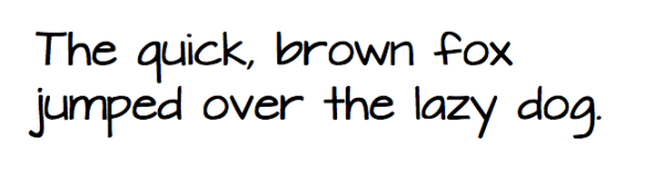
Unfortunately, you’ve made a mistake with the famous comparison sentence (pangram) because there is no letter “s” in your version. It should be:
The quick brown fox jumps over the lazy dog.
LikeLiked by 1 person
Century Gothic (Microsoft font) also has a true a.
LikeLike
Whenever I see that someone has used comic-sans, I feel a sense of duty to point out that it’s not the best font. As part of my job, I have to read policies and reports. Some people think they are helping me when they proudly say, ‘ I used a dyslexia-friendly font for you’.
Right through education, I was given documents with that font on. Interestingly, I found reading and writing much more manageable in college because I had tutors who understood that not everyone loves comic-sans. There was a point when one of my tutors was so tired of seeing comic-sans he banned its use in all our weekly essays.
Don’t get me wrong; for some people, cs is a great font, but I can’t find the words for others like me. I should say that while being a kid in school with a neurological condition, like many, I didn’t let it or (some of) the teachers hold me back. There are some great fonts out there & if you can’t find one to suit your needs, a new font can be designed.
LikeLike